
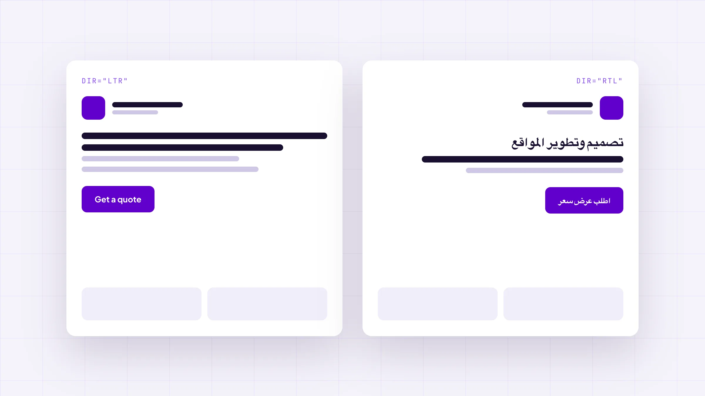
Translating the strings is the small half of Arabic support. The layout, the icons, the number formatting and the fonts all carry direction, and CSS logical properties fix most of it at the source rather than with a second stylesheet.
Arabic support fails on layout, not vocabulary. Direction affects spacing, alignment, icon orientation, scroll behaviour, number formatting and font coverage — none of which a translation file touches. CSS logical properties handle most of it at the source, which is why they belong in the first stylesheet rather than a retrofit.
Every GCC project we inherit has the Arabic strings already. What it does not have is an Arabic layout. The two get budgeted as one line item, and the second one is four times the work.
#What actually breaks
The list is remarkably consistent across projects. Padding that was padding-left now sits on the wrong side of the text. Card grids read right to left but their internal alignment does not. Every arrow points the wrong way. The back button and the forward button swap meaning but not appearance. Progress bars fill away from the direction of reading. Dropdown menus open off the edge of the viewport. Latin brand names inside Arabic sentences get reordered by the bidi algorithm into nonsense. Numbers render in whichever numeral system the font decides. And the type falls back to whatever the operating system has, which is Tahoma on one machine and something else entirely on the next.
#Logical properties, and why they are not optional
The fix for most of that list is to stop writing physical directions. margin-left becomes margin-inline-start. left: 0 becomes inset-inline-start: 0. text-align: left becomes text-align: start. The browser then mirrors the entire layout from the dir attribute alone, with no second stylesheet and no [dir="rtl"] override chain to keep in sync.
Written this way from the first commit, it costs nothing. Retrofitted, it is a full pass over every stylesheet in the project, which is exactly why it usually gets deferred and then quoted as a separate phase.
#What must not mirror
This is where automatic flipping tools produce the embarrassing results. Mirror anything that encodes direction of travel — arrows, chevrons, progress, undo. Do not mirror anything that depicts a real object. A logo does not mirror. A clock face does not mirror. A photograph does not mirror. A laptop mockup does not mirror, and neither do the screenshots inside it, because an Arabic reader uses a laptop with the hinge in the same place as everyone else.
#The font problem nobody budgets for
Most display faces chosen for a Latin brand carry no Arabic glyphs at all. The page does not error — it silently falls back to a system font, which means the Arabic version of the site is typeset in something nobody chose, and differently on iOS, Android and Windows. Choosing an Arabic face that sits comfortably beside the Latin one is a design decision, and it needs to happen before the type scale is signed off, not after.
- Use margin-inline / padding-inline / inset-inline everywhere; they mirror for free and need no [dir="rtl"] override.
- Mirror arrows and progress indicators. Do not mirror logos, clocks, device mockups or photographs.
- Latin technical terms inside Arabic prose need direction isolation, or the bidi algorithm reorders them.
- Neither Sora nor Plus Jakarta Sans carries Arabic glyphs — pick an Arabic face deliberately or the OS picks one for you, differently on every device.